Home > Teaching > Tutorials > R Tutorial Index
3 ::: Plotting in R
R is a powerful (and free) statistical software that is making headway into academic, government, and industry uses. It may be downloaded on r-project.org at no cost.
plot()
labeling the title and axes
plotting windows
plotting options
hist() and histogram()
boxplot()
stripchart() (dot plot)
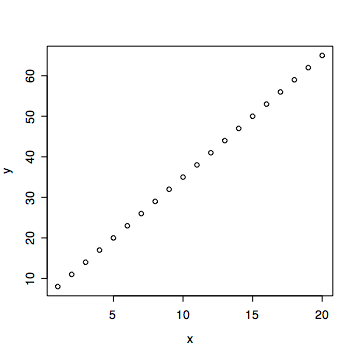
The most common plotting function is plot(). This function can take several types of objects. For example, below two vectors are created and put into plot:
> x <- 1:20
> y <- 3*x + 5 # creating a line with slope 3 and y-intercept 5
> plot(x, y)

It plots the second variable (in this case, y) against the first variable (in this case, x).
If there is a frequency table from two variables, plot can also read in the table and make a mosaic plot of the data.
> tab1 <- table(Year, Gender)
> plot(tab1)

The function plot is very versatile and this is by no means a thorough overview of its capabilities.
The title is called main in R. The x-label is called xlab (and the y-label, ylab).
> plot(tab1, main="This is the TITLE", xlab="x label", ylab="y label")

To open a new plotting window, use the command quartz() (verbatim). The number of plotting windows is only limited by a computers memory and the user's tolerance for pop-ups. This function will not work in all versions of R (or all platforms).
To put more than one plot on a single plotting window, use the following command:
par(mfrow=c(2,3))
This command will open a window with 2 rows and 3 columns (for a total of 6 plots). Change the 2 and 3 to customize the number of rows and columns of plots.

R offers a lot of plotting options to improve graphical representations. These are all completely optional in plots, however, they are often needed to distingish graphical features or to emphasize different parts of a plot. None of these are required to make a plotting function work. Below are several different arguments that almost all plotting function can use:
| argument | description (what to set it equal to) | example |
| main | allows the user to put a title on the plot (character string) | main="Title" |
| xlab, ylab | x and y labels (character string) | xlab="x label", ylab="y label">|
| xlim, ylim | x and y limits (vector of length 2, specifying the min and the max of the x and y directions) | xlim=c(0,8.5), ylim=c(-2,100) |
| pch | plotting character to be used (give a single number) | pch=3 |
| col | color (sRGB value or plain color as a character string) | col="#A42288" OR col="blue" |
This section is not yet complete. hist() is used to create a histogram. Althernatively, the function histogram() may be used after loading the lattice library. Below are sample uses of both:
> bumpus <- read.delim("http://www.stat.ucla.edu/~david/Bumpus.txt", T)
> attach(bumpus)    # attach the data
> hist(Length_mm)   # view the bird lengths as a histogram

> library(lattice)   # load the graphics library
> quartz()    # open a new plotting window
> histogram(~Length_mm | Survived) # view separate plots for birds that died/survived

This subsection is really just to show a few examples of histogram plots. Use the commands above as a template. To create a simple histogram of a vector of numbers, apply hist(). To break a histgram up into different groups, use histogram() (after loading the library lattice); the first variable is the name of the vector to be plotted and the second variable is the vector of levels that corresponding to the first vector.
This section is not yet complete.
To create a dot plot in R, use the function stripchart(). This function was first used in lecture with the midge dataset. If a dot plot of the midge wing length is of interest, then typing the data into R (there isn't much data so manually entering it in isn't so bad) and using stripchart() provides a visual representation of the data:
> wing <- c(1.78,1.86,1.96,2,2,1.96,1.72,1.64,1.74,1.7,1.82,1.82,1.9,1.82,2.08)
> stripchart(wing, main="Wing", method="stack")

If method="stack" wasn't used, then the positions with the same value would overlap one another, making it impossible to see all the points. Instead of method="stack", another popular option is method="jitter" (which is not shown here -- try it).
Next, suppose there are two groups that are of interest and on the plot each different type needs to be distinguishable. Then something like the following may be in order:
> type <- c(rep("apf",6), rep("af",9))
> stripchart(wing[type=="apf"], pch=1, method="stack", main="Wing", xlim=range(wing), col="blue")
> stripchart(wing[type=="af"],pch=2,method="stack",add=T, col="red")

Notice that there are some additional attributes used for the second plot. pch is used to make each different type have a different plotting character. add=T is used to add points to the plot -- if this argument wasn't used, the first points would be lost when the second dot plot was created. xlim was used to ensure all points were included in the plot (the function range() returns a vector of the min and max of a numerical vector).